
Warning!
You must be at least 18 and have an active library card to view these images.
Chin Music Press books have been known to make adults coo and tremble. Strangers will visit our booths during book fairs just to run their hands all over our hardbacks and seductively strip our one paperback (so far) of its jacket. They’ll let their fingers riffle through the paper and drink in the four-color artwork inside. The photos featured here may make men blush and women fidget. Chin Music Press is not liable for sudden spending sprees at your local independent bookstore or bouts of complete and utter disdain for your Kindle. View and click on the photos below at your own risk.
-

- The cover design is simple and mysterious and subtly invites the reader to participate in the novel
-

- Linda Shimoda’s artwork for Oh!—the latest novel from Chin Music Press—is integral to the novel and the book design.
-
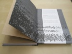
- The endpapers in Oh! are a detail of Aokigahara from Hokusai’s famous print of Mt. Fuji—South Wind, Red Dawn.
“Chin Music Press has created a book of visual delight.” — Shelf Awareness
Needless to say, Oh! was a pure joy to design. I not only had Todd’s amazing story to work with, but Linda’s gorgeous art as well—nearly 100 pieces in total. It was great to have a project that was so visually rich right from the beginning.
In the book, each chapter opens with a small pen and ink sketch, an “exhibit” from Zack’s sketchbook illustrating something Zack sees in that particular chapter. Then there are the full-color pieces: giclee prints of color photographs with wash on rice paper, and Linda’s own calligraphy in sumi ink on top. The sketches are treated much more as distinct entities in the book design, clearly demarcating each new chapter. The giclee prints, however, have been intertwined much more deeply with the narrative and the text. They follow a progression; they are slowly revealed, in a sense, in much the same way as Zack progresses emotionally throughout the novel.
For Oh! I wanted the front matter to be subdued, somewhat prolonged, quiet and unassuming, slowly leading the reader into the story that awaits them. Linda’s art appears on one side of each spread, the opposing page of the spread empty and sparse. Here is the reader’s first encounter with the artwork, stripped of its color, cropped and abstracted. The rough brown paper it is printed on—full of wabi-sabi in all its imperfections: dark spots and tiny flecks of color throughout—further obscures the art and alludes to the cardboard boxes that play a role in the story. As we move into the novel itself, the artwork is presented uncropped, though still devoid of color and at a low opacity, sometimes with text (Zack’s notes on mono no aware) layered over top. Finally, between the abrupt end of the final chapter and the summation of the epilogue, select pieces of art are shown again, this time in full color and full opacity. This allows the reader the chance to reflect on what has happened before moving on to the epilogue, but it also reflects what happens with Zack at the end of the novel, the artwork become a visual “oh!” moment.
When I was designing the book, Linda was kind enough to send the giclee prints to Seattle so I could scan them. They are even more beautiful in person, with subtleties like the way the paper has moved and shifted, creating tiny valleys and indentations, and the way the ink shows through the back of the thin rice paper. I’ve tried to give the reader some sense of the physicality of the artwork by presenting several pieces from both the front and back. In the full color spreads, on several occasions you can view the art from the front on the recto and then flip the page and see the back side of the art on the verso. This motif also carries over to the front cover art, with the actual back of the art image appearing on the back cover of the book, the two sides of the image anchoring the layers of pages in between. I like thinking of a book as layers, almost like the sedimentary layers of the earth, and I think that Oh! captures this in all its multiple layers—the tipped in art on the covers, the debossing, the two sections of brown paper, the text paper, the bleed images and the four-color insert.
Other secondary elements of Linda’s art show up in the design as well. An ink covered thumbprint and stippled ink (created from writing in ink on the rice paper, which bled through to the paper below) have been used on the brown paper as well as the back wrapper. The back wrapper (whether the reader chooses to keep it on the book or not) interacts with the rest of the book, hiding the back cover art so that it’s not immediately apparent and allowing the trees from the endpaper to continue across the wrapper itself.
I’ve always been drawn towards the medium of collage, I think perhaps because I enjoy making connections between different images, as well as between ideas and imagery. Therefore a couple of other images worked their way into the design of Oh! I used parts of two separate prints by Hokusai to help visualize the forest of Aokigahara, which plays a central role in the book. The endpapers feature a cropped portion of one of Hokusai’s most famous prints, “South Wind, Clear Dawn,” commonly referred to as Red Fuji. Cropped and reduced to gray-scale, the image becomes abstracted, with the tiny trees growing on the bottom slopes of Fuji becoming less recognizable for what they truly are. Secondly, on the spine and in the front matter appears a part of the print “Fuji from a Pine Mountain,” an exquisite pattern of overlapping pine trees which alludes to the pine forests that grow around Fuji’s environs and in which several key scenes of the novel take place.
The cover more or less speaks for itself, quiet and understated as it may be. It is minimal, the subtitle omitted and a simple “Shimoda” standing in for both husband and wife. In a wabi-sabi fashion, this cover aims to intrigue, but through its simplicity belies the complexity of the story it contains. It evokes a bit of mystery, debossed type revealing itself more or less depending on the lighting, a tiny white circle on the spine creating a repetition among the two cloud-veiled moons that appear on the front and back covers.
